As Matias Duarte and the team over at Google's Android Design department ready their wares, they've given us a preview version of the upcoming "L" release of Android to try out.
A new design philosophy, dubbed "Material", permeates throughout the new OS. Most apps have yet to be updated to include this design language, but the Google Now Launcher has already received a touch of these new design elements.
Normally, you'd have to install Android L to get the underlying framework to actually see these changes. But developer Alexander Schulz has updated his ever-popular Xposed module, Xposed GEL Settings, to allow us to enjoy these slight UI changes on KitKat.
Prerequisites
- Your device must be rooted. Check out my rooting guide for the Nexus 5 to get it done in just a few minutes, if you haven't already. This also works on any other rooted Android device running 4.4 and higher.
- After rooting, make sure you install the Xposed Framework, which allows you to run a bunch of cool mods.
- In order to install the Xposed mod, you will also need to enable Unknown Sources on your device.
- Lastly, you'll need the Google Now Launcher. On the Nexus 5, it's the stock home screen app, so you don't need to download it—only other devices need to.
Install Xposed GEL Settings
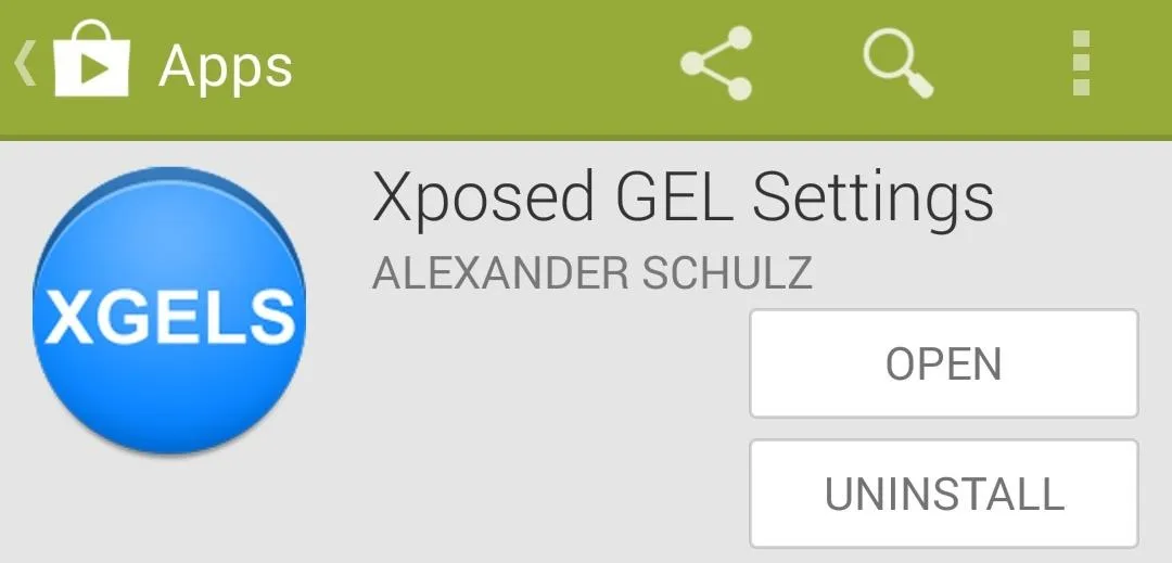
Schulz's module is available for free on Google Play. You can either search your Play Store app for Xposed GEL Settings, or you can tap this link from your device to get it installed.
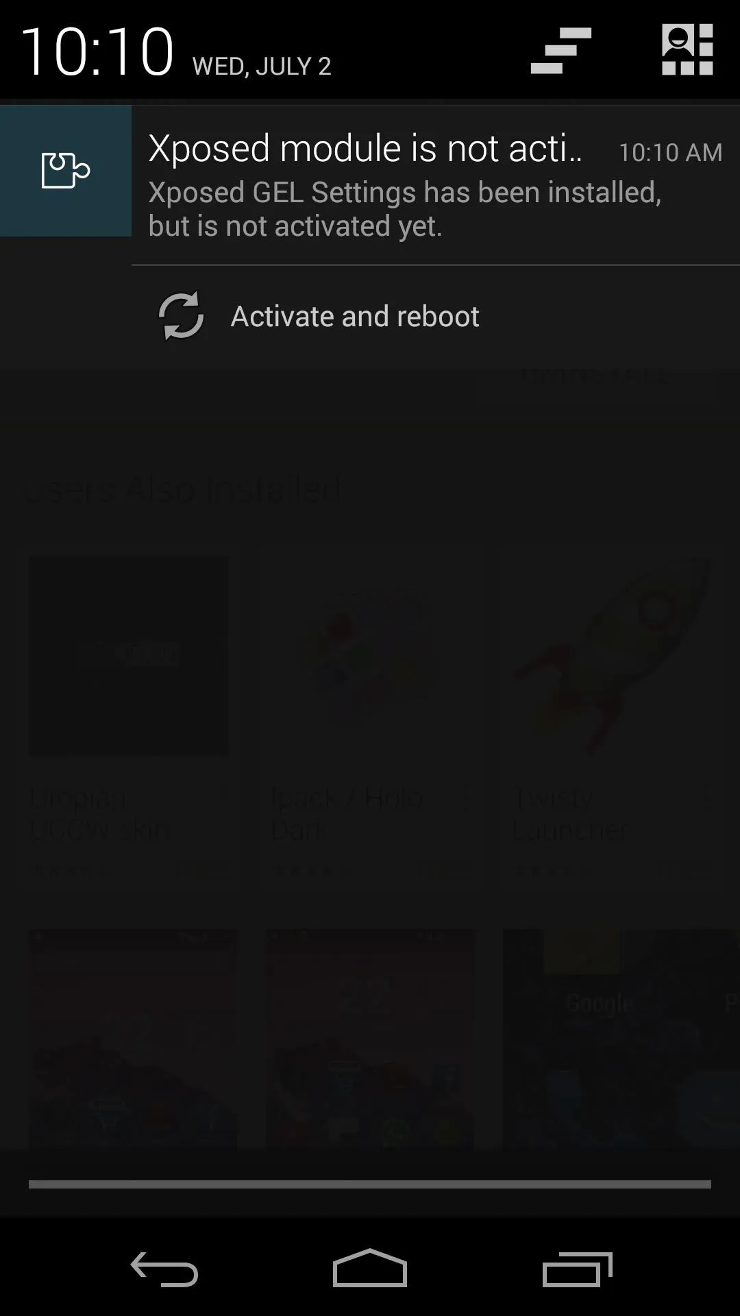
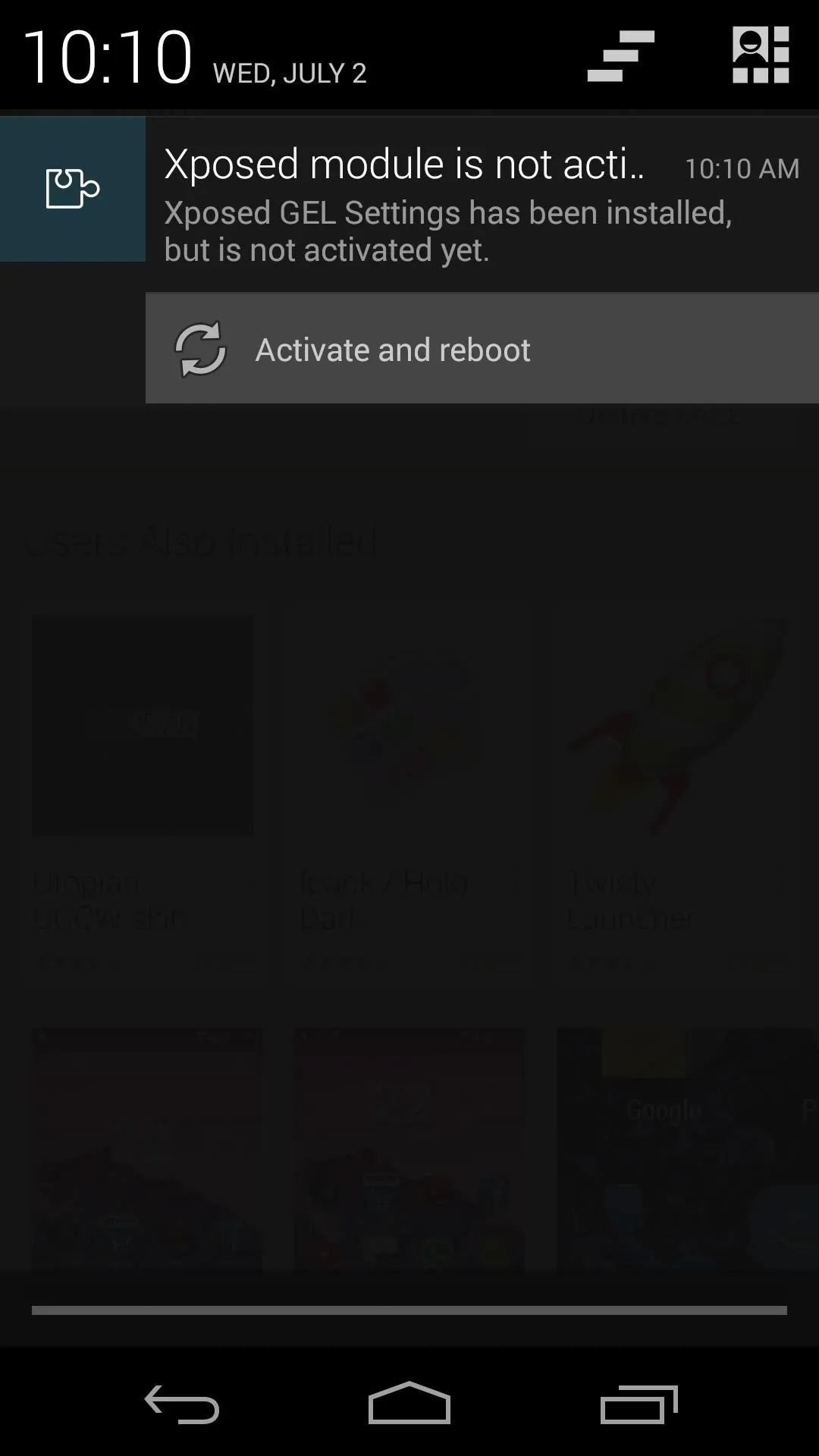
When you've got the app installed, you'll get a notification from Xposed that tells you the module included with this app needs to be activated. Tap the Activate and Reboot button here, and Xposed will take care of the rest for you.


Configure XGELS
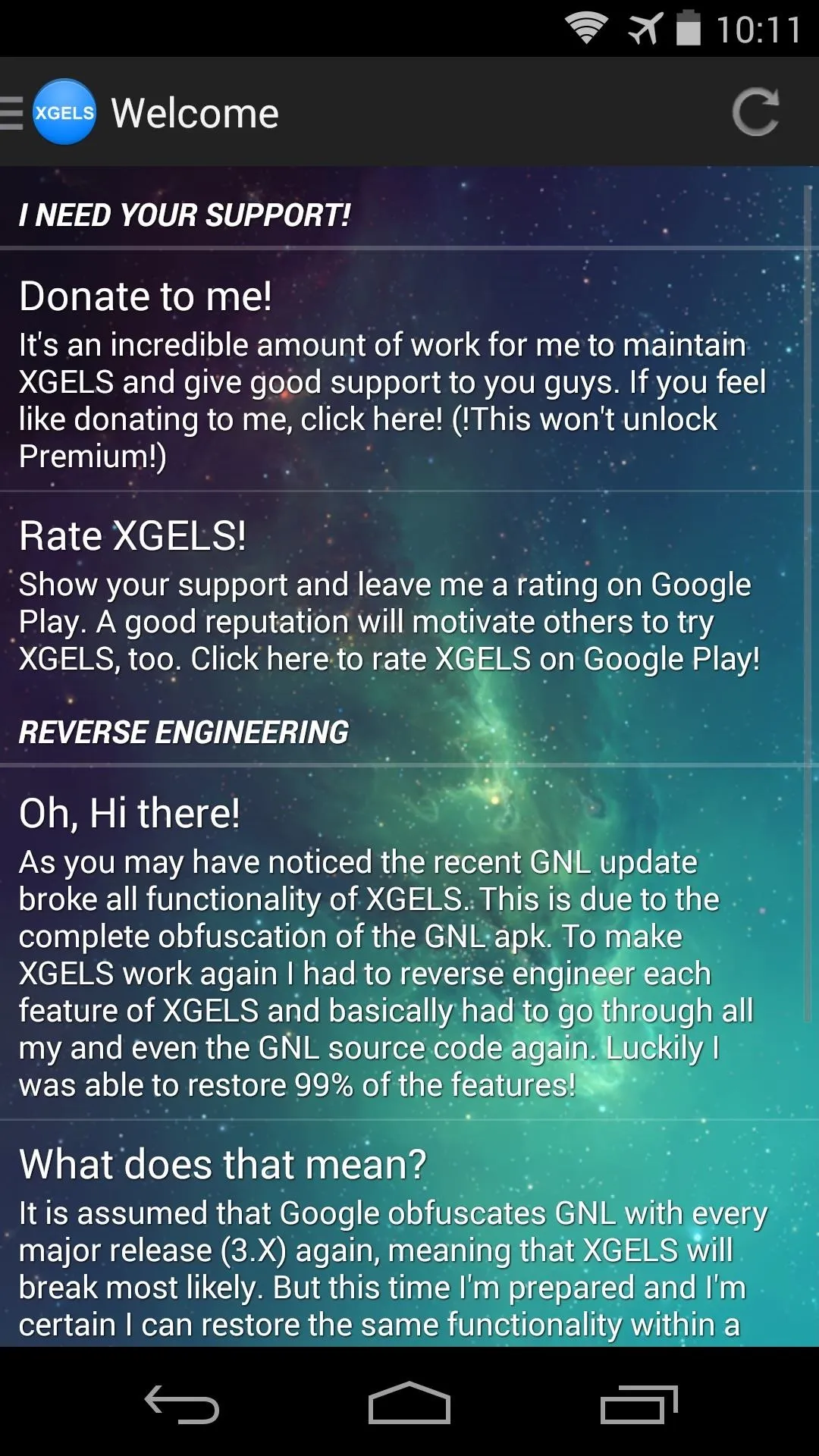
When your phone finishes booting back up, go ahead and jump right into Xposed GEL Settings from your app drawer.
There are a lot of other settings in here for customizing the Google Now Launcher—some of which we've covered in the past—but we're only concerned with one option for today's purposes.
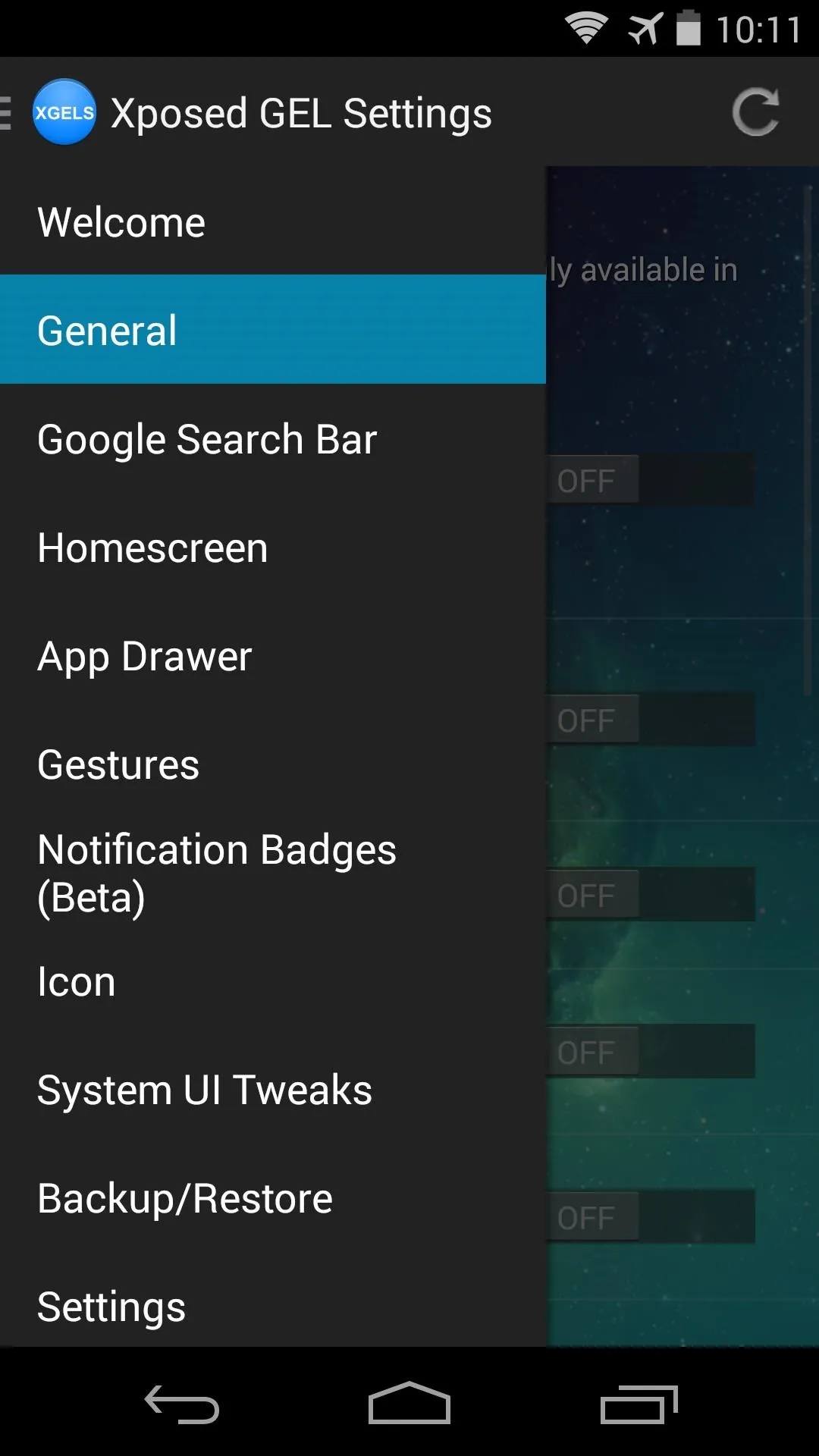
Swipe in from the left edge of your screen to reveal the side navigation menu in XGELS. From here, head to the General section.


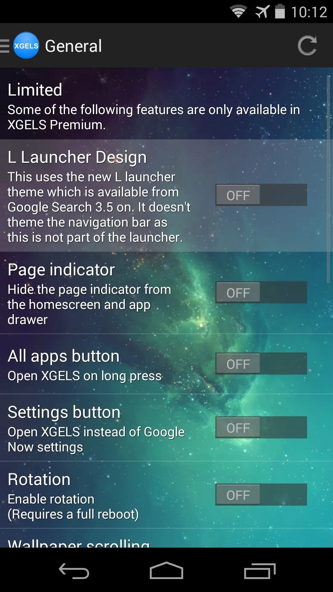
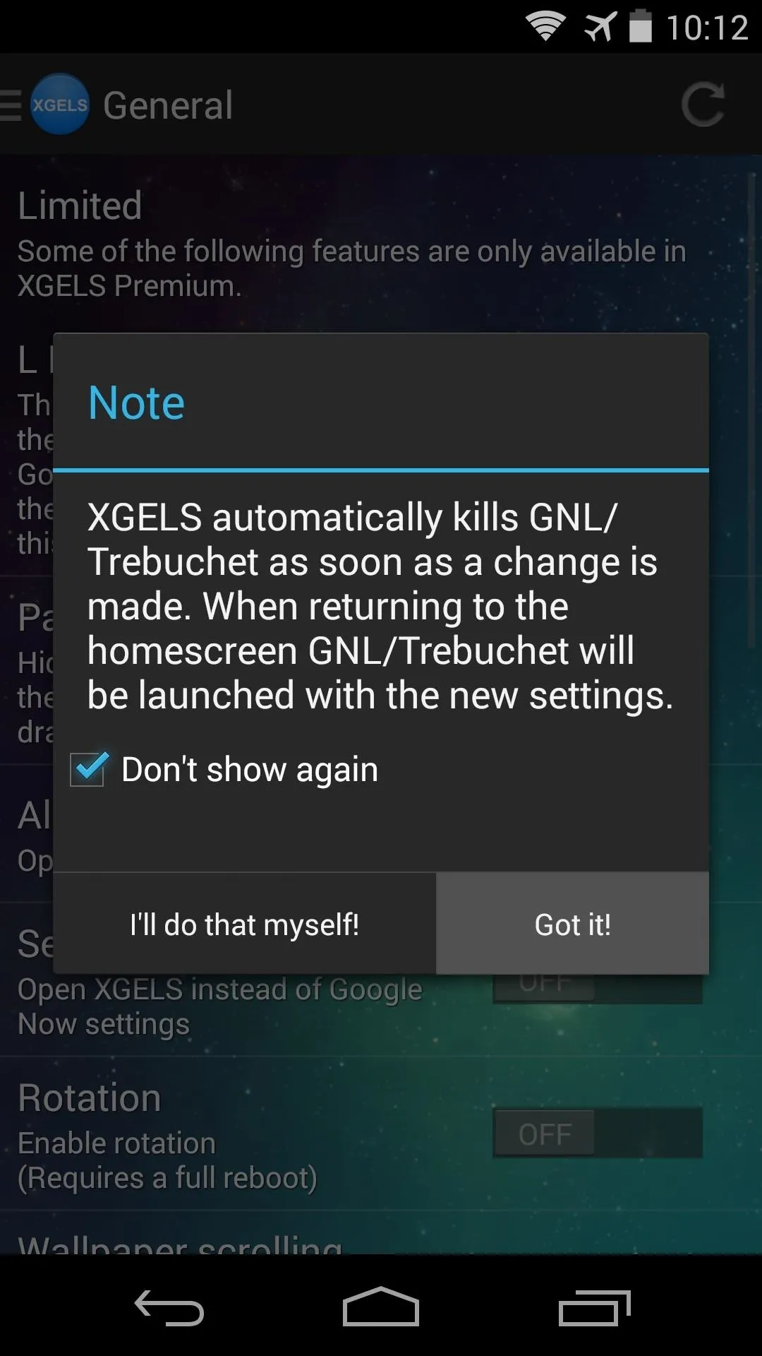
The second menu entry in this section is the one we want—L Launcher Design. Toggle that to On, then you'll get a message from XGELS letting you know that the module can restart your launcher automatically so that the changes can take effect. Tick the box next to Don't show again and press Got it.


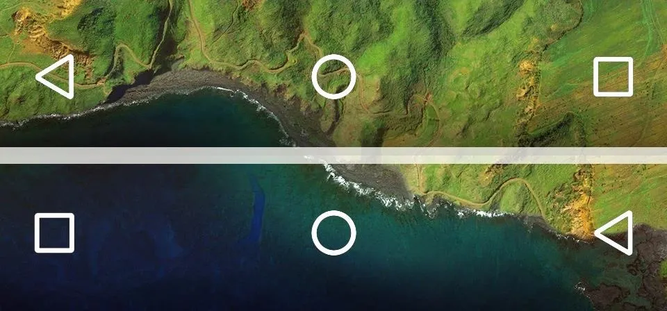
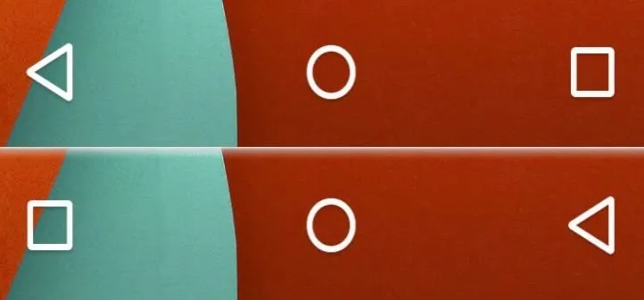
Now, if you head to your home screen, you can already see the Material Design characteristics in place. The app drawer button has the new style, and folder icons are now centered rather than offset.
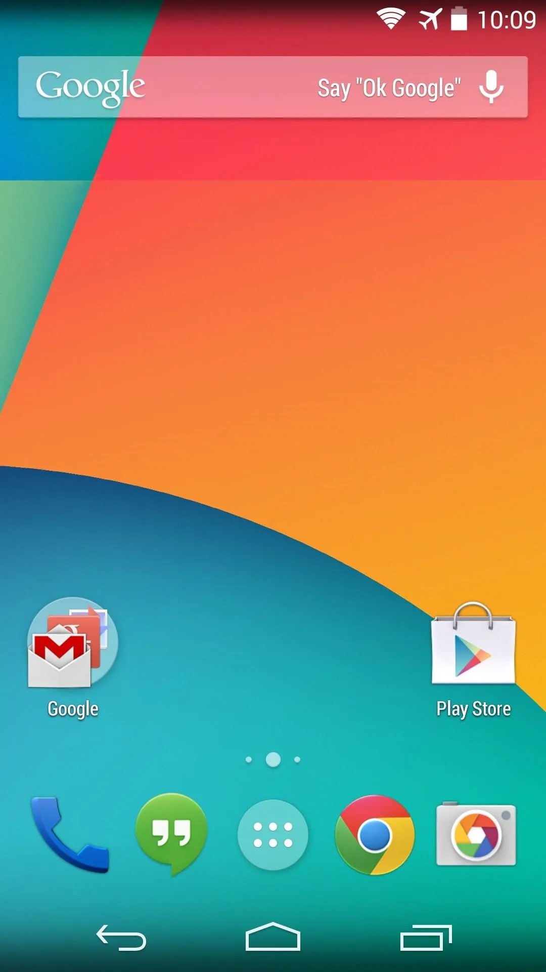
KitKat design.
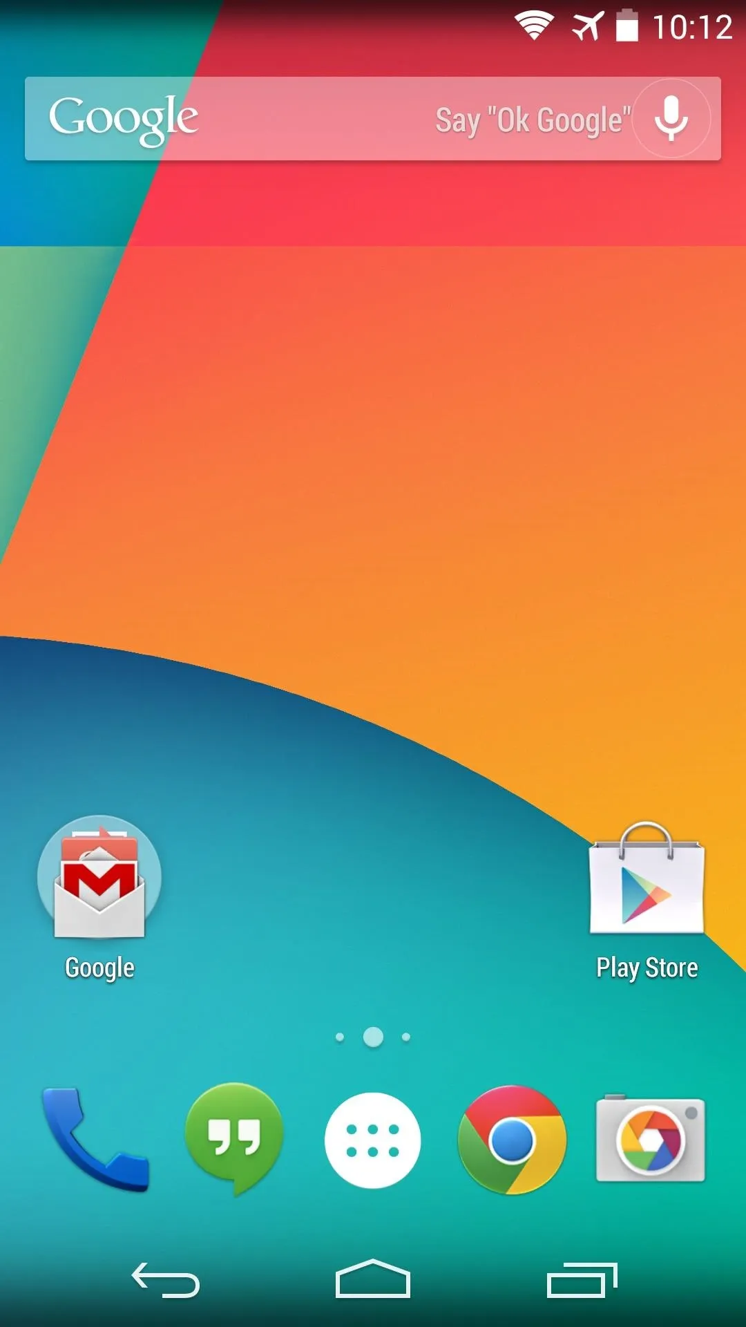
"L" design.

KitKat design.

"L" design.
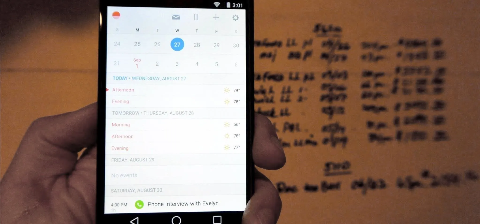
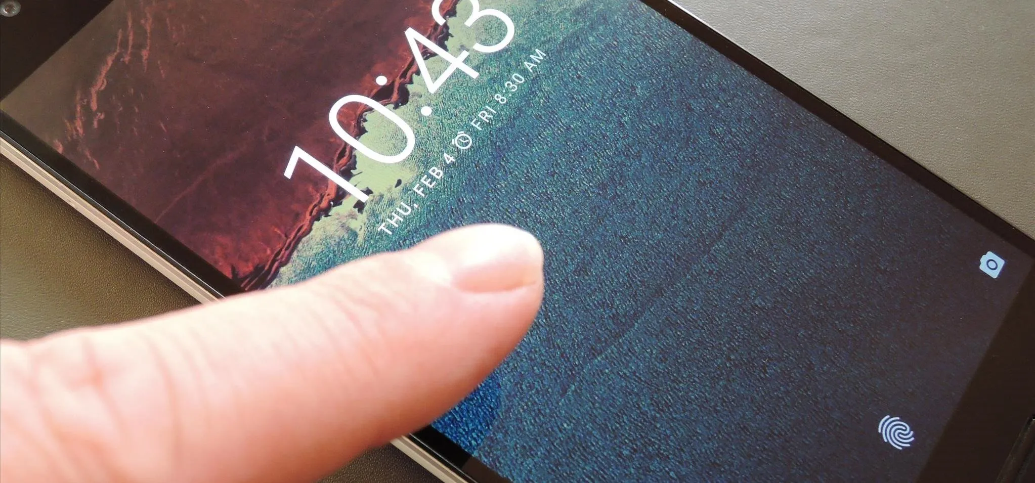
Long-press any open space on your home screen, and you'll see that the Settings menu is a bit different as well. Even transition animations have received the "L" treatment.
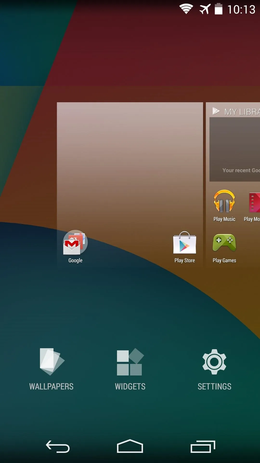
KitKat design.
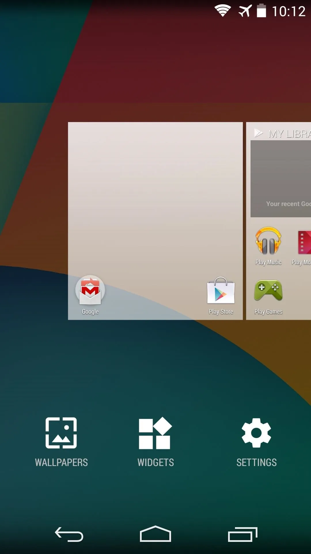
"L" design.

KitKat design.

"L" design.
Although not in its final form, it's good to see that the Google Now Launcher is receiving attention from Android's design department.
How are you liking these "Material" touches? Have you tried out the new Calculator and SystemUI tweaks from "L"? Let us know in the comments section below.







Comments
Be the first, drop a comment!