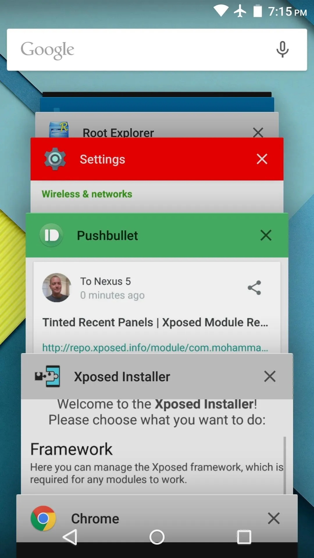
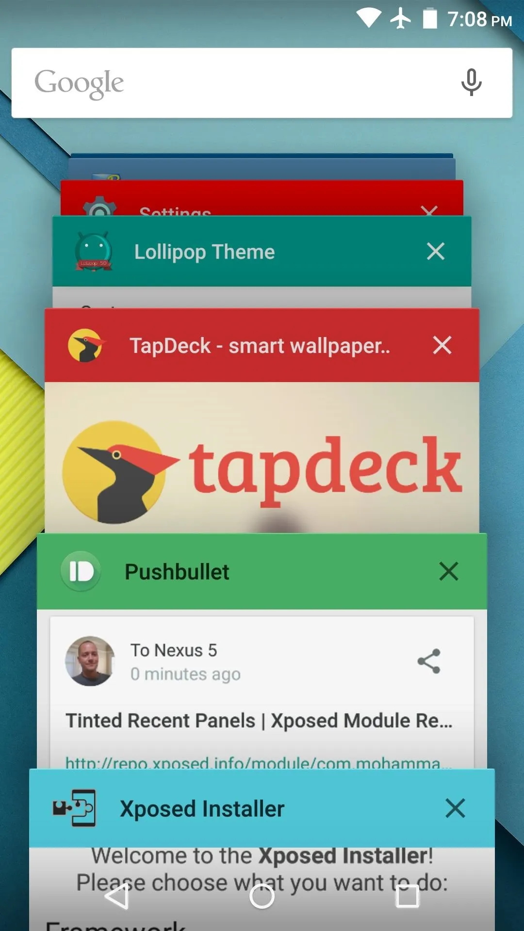
The Overview screen (aka Recent Apps) on Android got a huge upgrade when 5.0 Lollipop was released. Chrome tabs now hold separate entries in this multitasking list, which also got a nice new Material Design theme. One of the biggest changes, though, was a new API that allows apps to color the header on their entries in this list.
Unfortunately, not all developers are quick to adopt new features like this one. Many apps still have the default grey header, and look rather drab next to their colorful counterparts here.
So developer MohammadAG decided he'd take matters into his own hands. With his latest Xposed module installed, all apps on your system will have colored Overview headers—whether they've been updated to utilize the new API or not.
Requirements
Install Tinted Recent Panels
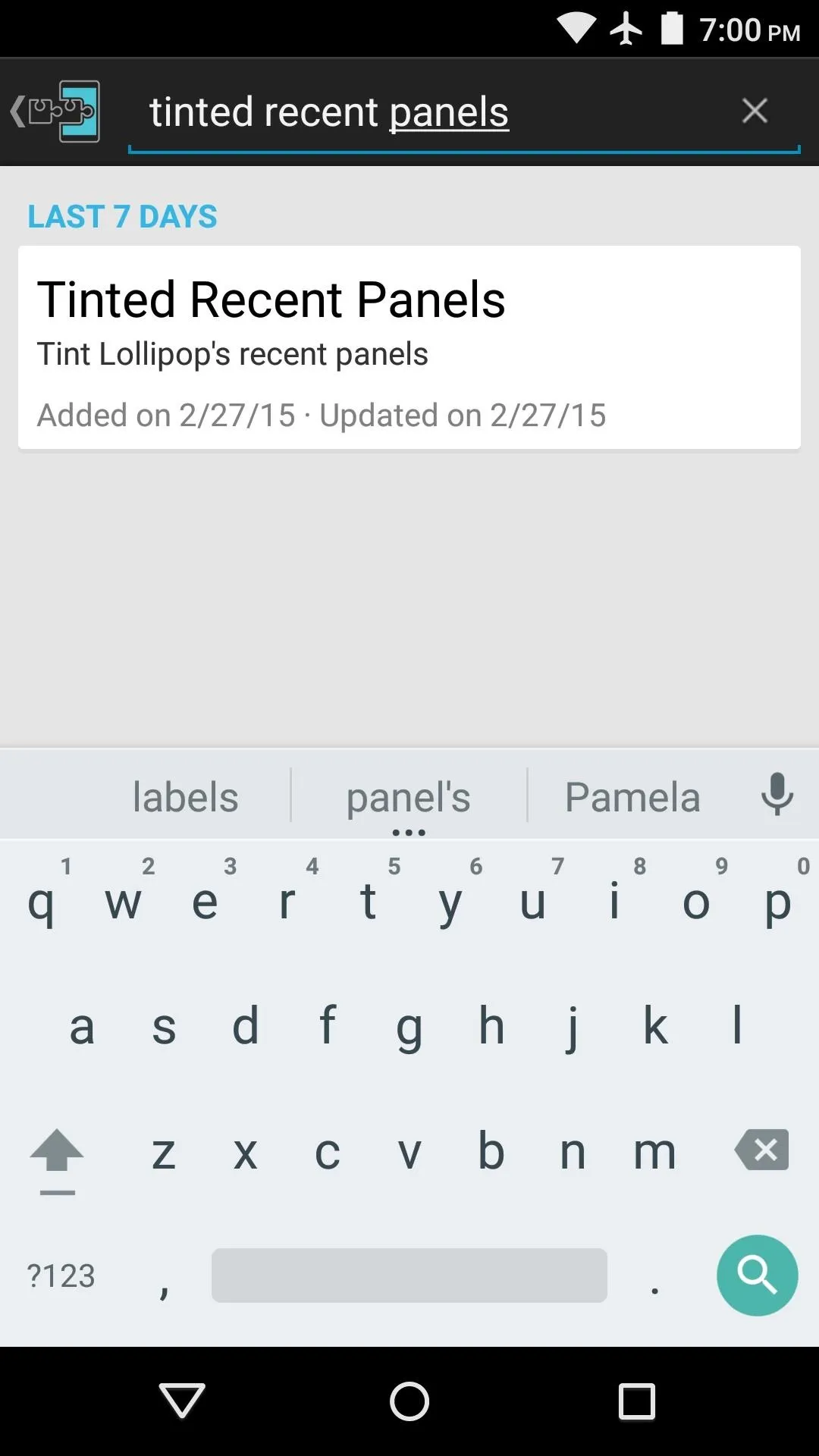
To begin, head to the Download section of your Xposed Installer app and search Tinted Recent Panels, then tap the top result.
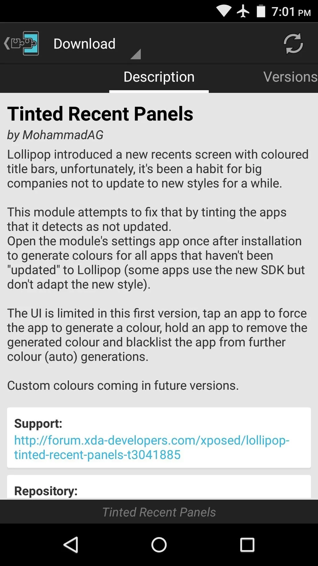


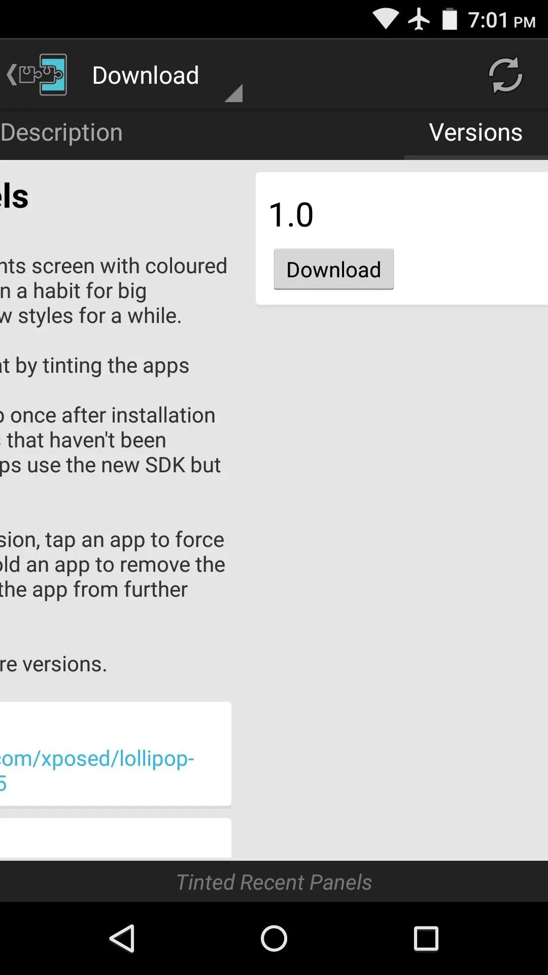
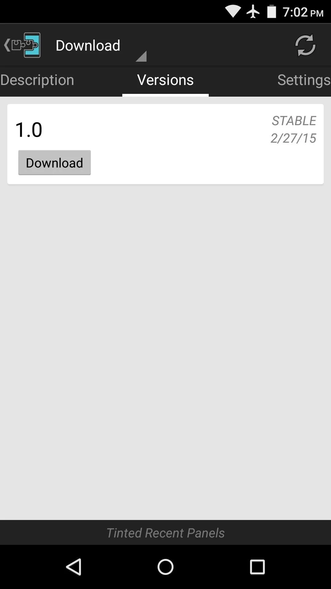
From here, swipe over to the Versions tab, then hit the "Download" button next to the most recent entry.


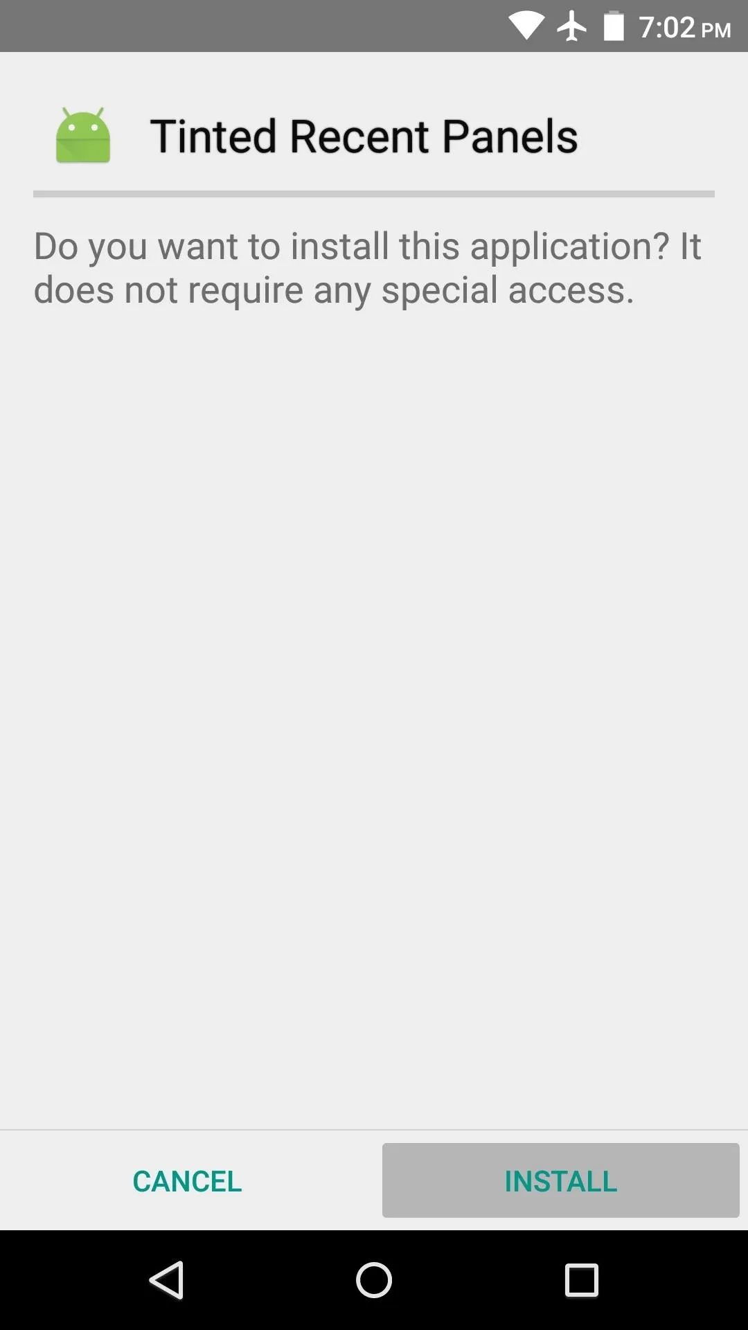
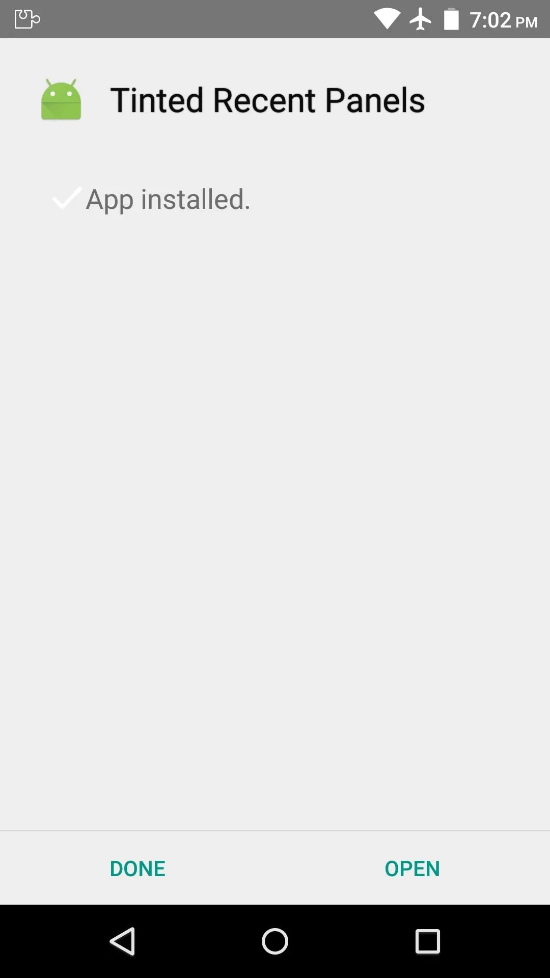
Within a few seconds, Android's installer interface should come right up, so tap "Install" on this screen.


Activate the Module & Reboot
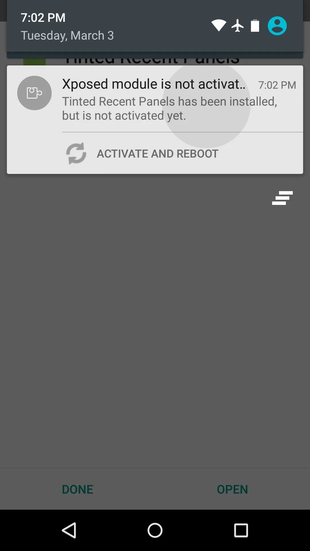
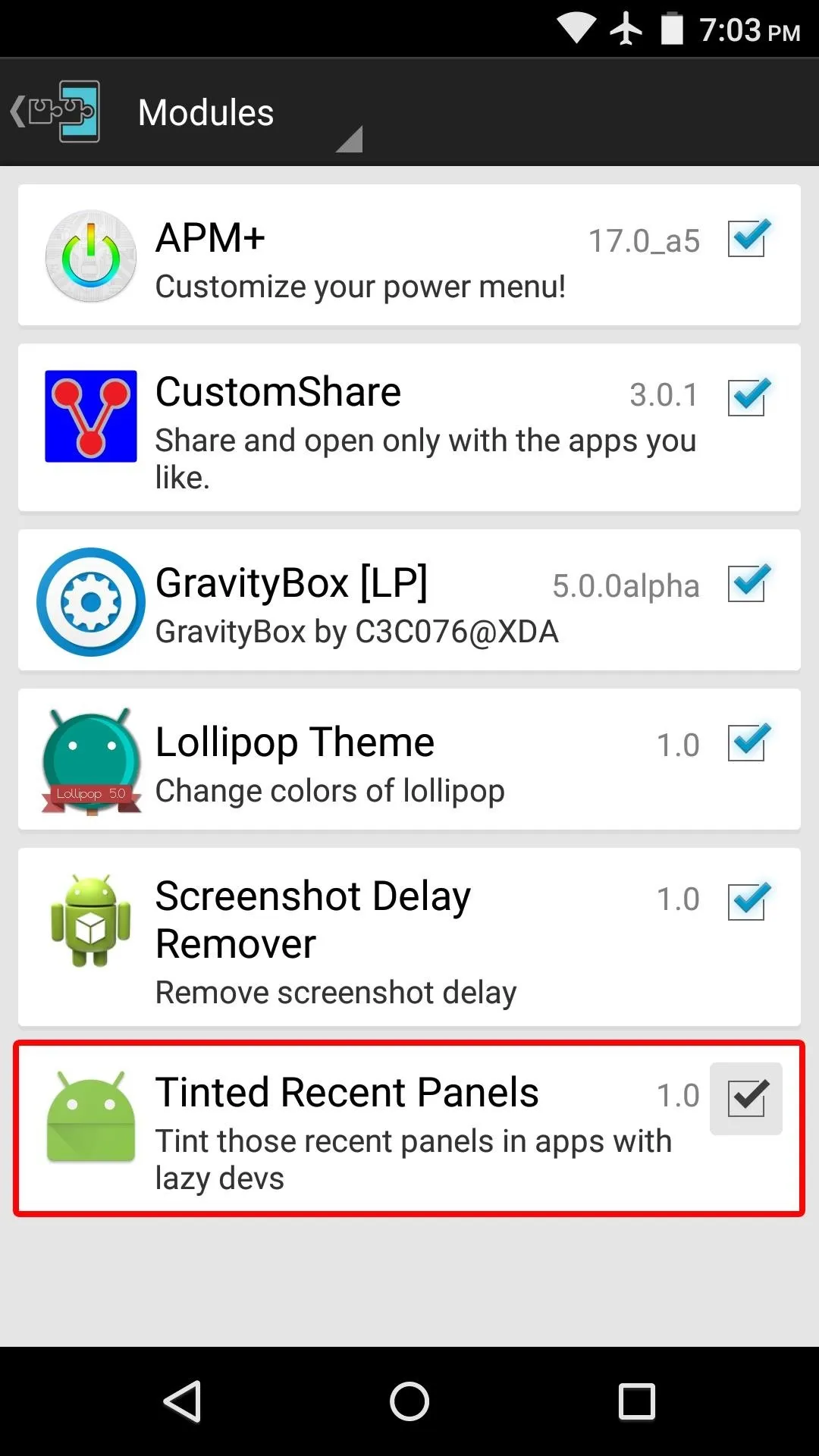
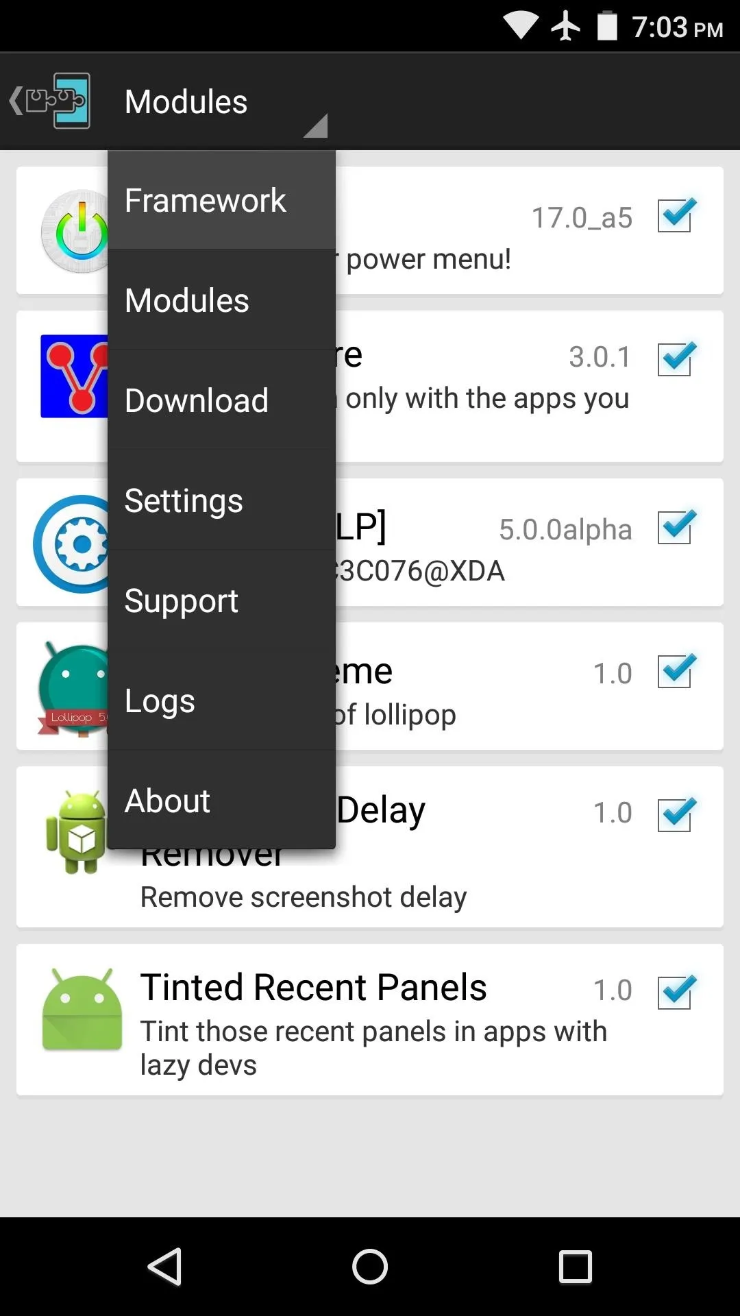
When installation has finished, you'll get a notification from Xposed telling you that the module hasn't been activated yet and that a reboot is needed. Tap this notification, then on the following menu, tick the box next to the newly-installed module.


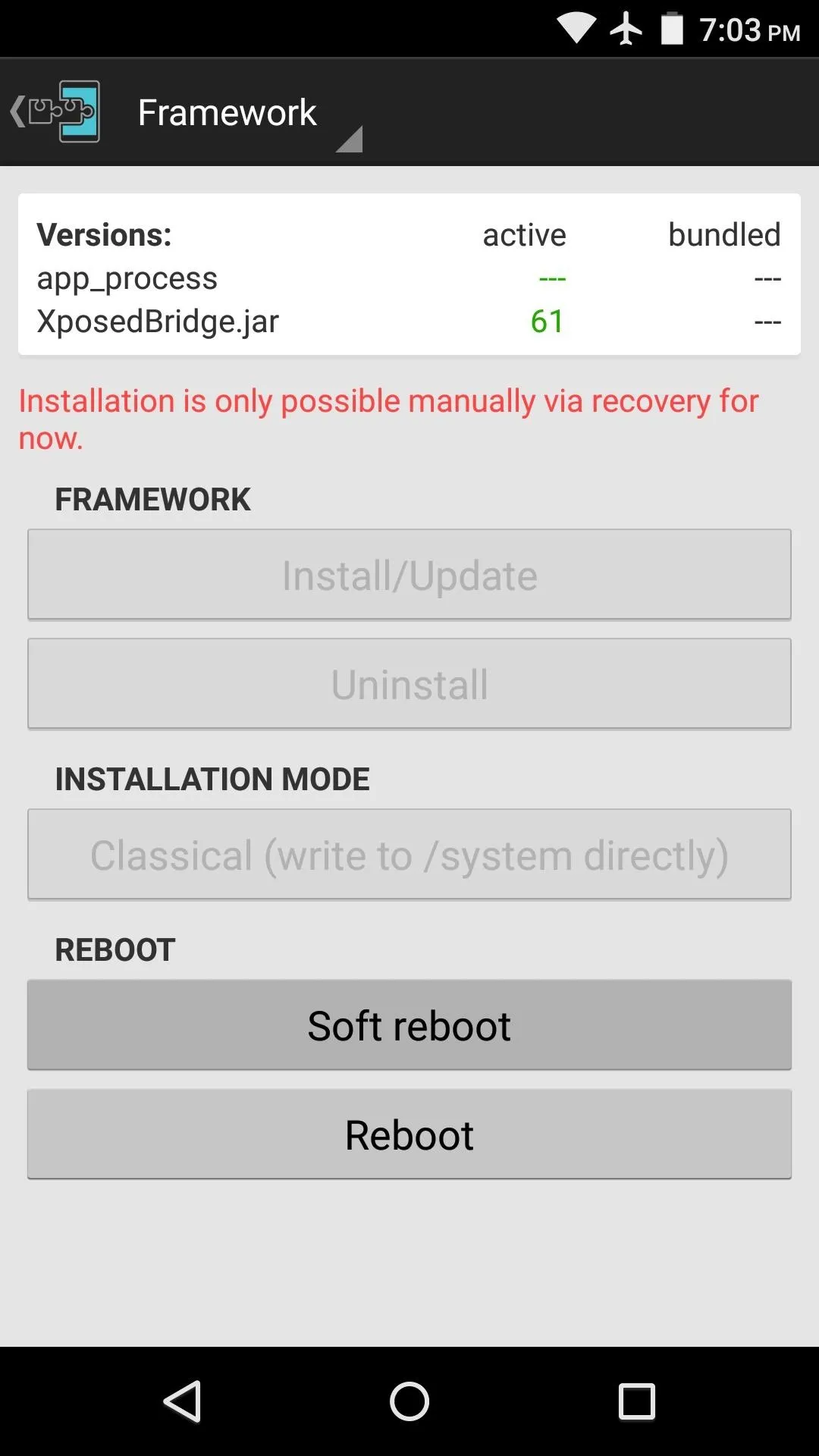
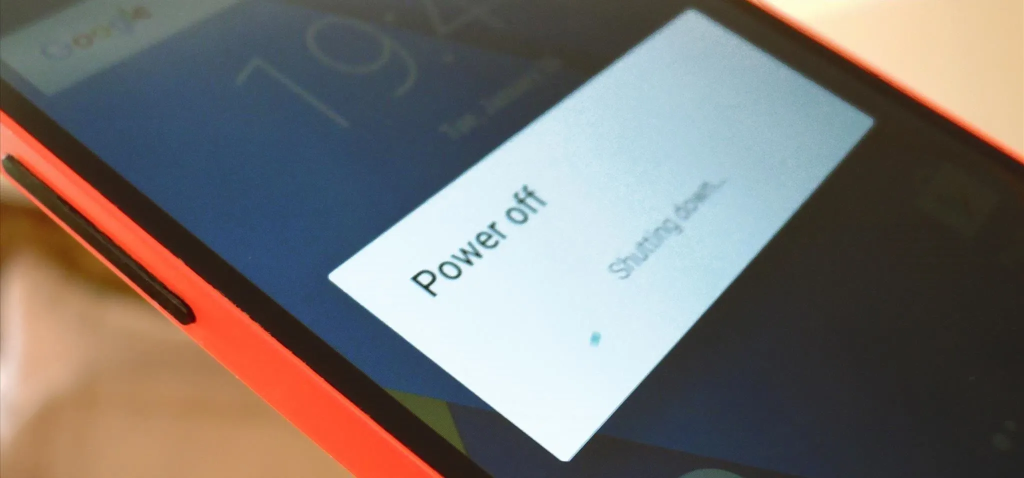
From here, use the drop-down menu at the top of the screen to head to the Framework section. Next, tap the "Soft Reboot" button, then press "OK" on the popup.


Additional Configuration
When you get back up, almost all of the apps in your Overview menu will have colored headers. The module should analyze your installed apps to see if they have implemented the new API, and if they haven't, it should match their headers to the predominant color used in the app.
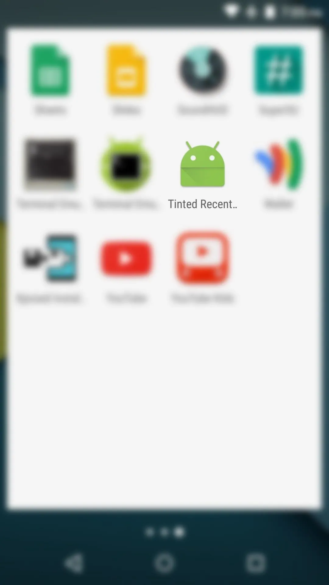
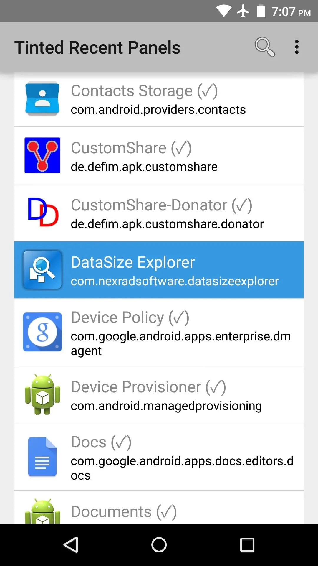
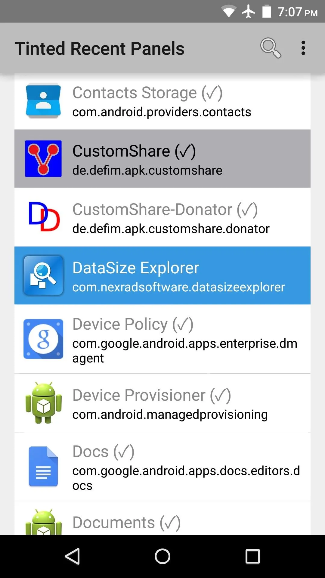
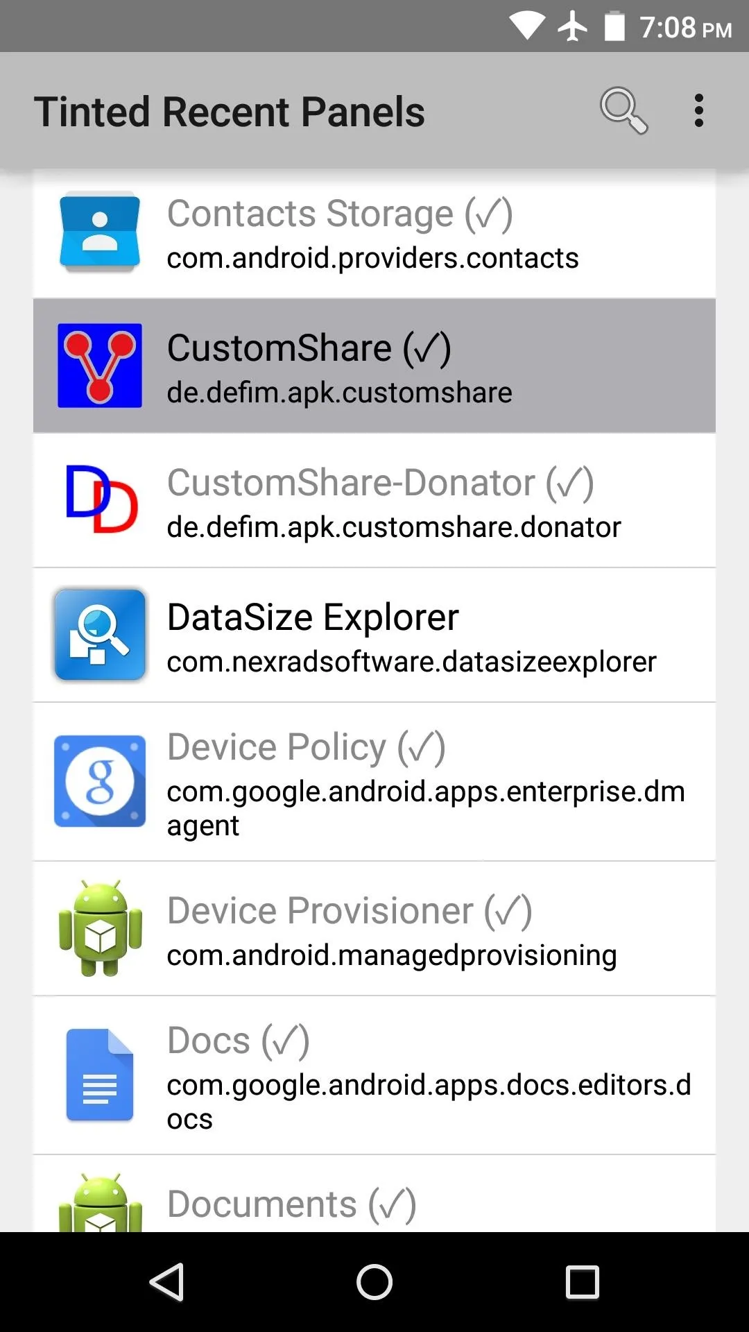
If you encounter any apps that the module didn't automatically color, take a quick trip to your app drawer and launch Tinted Recent Panels.
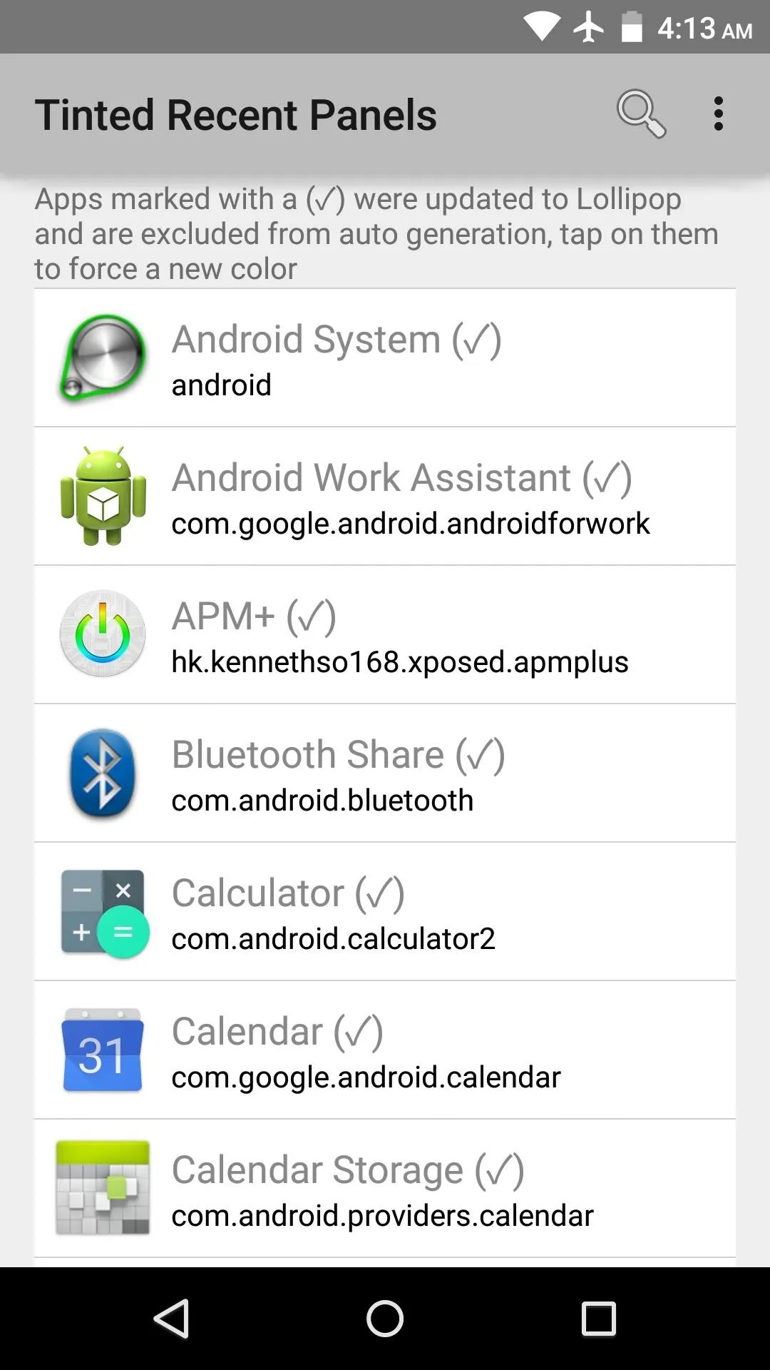


Any apps with a checkmark beside their names in this list are already using the new API, and apps with a color superimposed over their entry were fixed by the module.
If you find an app that the module didn't fix automatically, simply tap its corresponding entry in this list. Or, if there's an app that the module fixed, but you'd like to remove the coloring, long-press the entry to do just that.


At this point, your Overview menu should be nice and colorful.
Before
After

Before

After
In the future, the developer plans to add an interface that will allow you to select custom colors for each of your apps, so keep an eye out for that update. In the meantime, which apps did this module fix for you? Let us know in the comment section below, or drop us a line on Facebook, Google+, or Twitter.









Comments
Be the first, drop a comment!